Trademarks
ll Debut
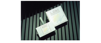
Beecham's brand, ll debut, had been revitalised with a hypo-allergenic ingredient for their skin care range. Trademark design proposed a strategy of creating a contemporary package presentation. A horizontal rectangular glass container was sourced then dipped in a bright white coating. A new screw closure was moulded then a brushed aluminium sleeve pressed over the h.d.p.e. closure. A minimal label design and carton presented a value added image to the once tired brand. The brand was marketed in 25ml and 50ml. The design won a gold Clio statue in New York.
> Read more
Sixth Sense
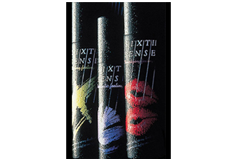
Sixth Sense is challenging Impulse for the teenage body spray market. Toiletries to drinks giant Beecham is challenging Elida-Gibbs' Impulse in the £24m [pounds] body spray market, with the launch of a brand called Sixth Sense. The brand will be aimed at teenagers, who Beecham claims account for almost a third of all body spray purchasers. It will be pushed with an £800,000 [pounds] press and radio advertising campaign. The body spray market has long been ruled by Unilever subsidiary Elida-Gibbs' Impulse brand, with 65.8% market share.
> Read more
Bodymist
Beecham toiletries brand Bodymist sales spiralled when the advertising agency re-launched the brand with the then famous "sailor" campaign. Simultaneous to this we had redesigned the closure and surface graphics to reflect a more outgoing feminine look and feel. The range consisted of five variants of floral fragrances, all colour keyed to the appropriate flower. This success started a trend to re-launch the package graphics every 24 months, each time, the Bodymist market share climbed to number two.
> Read more
Pears
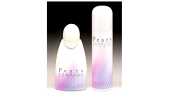
From one man in a tiny home-made laboratory, to today's state-of-the-art R&D facilities led from Bangkok, Mumbai, New York and Tokyo, the Pond's promise has remained the same across 58 countries: to deliver products that make a real difference to women's skin and the way they live their lives. Pears feminine deodorant, a brand of Ponds Unilever required a more sophisticated image to attract the price commanded by this quality brand. The design has matt finish to the surface giving it a minimal and delicately feminine feel with impressive shelf appeal.
> Read more
Revlon Flex
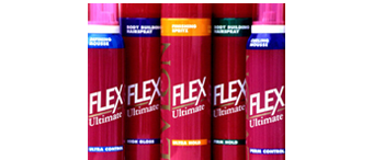
Revlon commissioned Trademark Design to design their range of hair styling products containers to offer multiple benefits such as, silk and protein to moisturise, srengthen and restore hair. They contain UV and heat protection and do not leave residue on hair. Revlon wanted to create strong shelf impact and more awareness for the brand without detracting from the visual cosmetic appeal. The solution was to create a "gestalt" effect on shelf by retaining a constant colour across the range. Variant differential is achieved by a system of colour coded bands above and below the Flex branding on...
> Read more
Silvikrin Shampoo
Beecham's toiletry range included the brand of Silvikrin shampoo. The previous surface graphics and container were steeped in 50's styling and did not project any benefit over the competitors on shelf. Trademark Design recommended the strategy of maximising the consumer facing area of the structural package, in simple terms, creating a small poster to draw the attention of the potential consumer. The diameter of the dispensing orifice was increased to offer a more generous volume of shampoo resulting in a more luxurious experience.
> Read more
AquaVelva
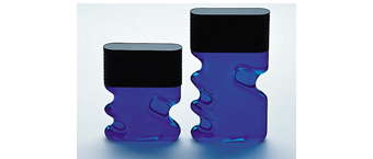
SmithKline Beecham in the United States commissioned Trademark Design to develop contemporary branding for AquaVelva after shave lotion. Research results indicated that the brand's target consumer was the tough, macho man. In line with this positioning, Trademark Design developed the "pistol grip" glass package form that fits a man's hand in the concave recesses. The twist-off closure simulates the cooling fins of a motor cycle cylinder.
> Read more
Brylcreem
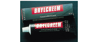
The hairdressing range since 1928 has over the years come and gone and come back again. This package design was developed specifically for SmithKline Beecham Canada where the container is a tube and carton compared to most markets that use a circular tub. Trademark Design proposed a departure from the traditional red package to this mat and gloss black design of straight and waved "hair" lines whilst retaining a red panel for the logotype. The colouration proved successful and was adopted in the countries where the brand is marketed.
> Read more
Status
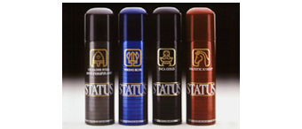
SmithKline Beecham provided Trademark Design with the brand name of "Status" which had been developed by their adverting strategy at the that time. It was cast in stone.
> Read more
SmithKline Beecham provided Trademark Design with the brand name of "Status" which had been developed by their adverting strategy at the that time. It was cast in stone.
> Read more
