Trademarks
GlaxoSmithKline
John M Clarke, President Worldwide, GlaxoSmithKline Consumer Healthcare has worked with Trademark Design for more than 25 years. "The relationship has been an enduring one, in countries including South Africa, the UK, the US and Canada. The design work and its Global application have always been of world-class standard and bought excellent results in the market place." The Future group, created to bring the GSK Healthcare world closer together. The new Healthcare Future group has been formed to apply the known success factors of the existing GSK Healthcare...
> Read more
Vamp
Trademark Design was approached to consider a name and trademark for a small project consultancy adding value to medical products and practices. We decided on the name Vamp as it is an acronym for 'Value Added Medical Products'. By creating a medical cross device with 'building blocks that fit perfectly in place, the mark literally communicates the method'. The device was created with an animation in mind, by sliding the cubes in together from 6 different directions.
> Read more
Medical Research Institute
A US medical advertising agency had been commissioned to develop an adverting campaign to launch a new facility of the Medical Research Institute. Simplistically, most medical research is study and investigating causes and cures for a condition. Symbolically integrating an eye device into a medical cross gives a minimal interpretation that can be applied to just about any aspect of the institute. Not only is this trademark appropriate but elegant and economic.
> Read more
Aquafresh Global
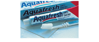
Aquafresh was a prospering brand behind Crest and Colgate and was supported by advertising promoting the fresh breath, whiter teeth and anti-tartar ingredients in the stripes. Major markets included USA, UK, EU and the East. This diverse market distribution played a key role in the disparate packaged brand compliance, resulting in costly bespoke advertising having to be created for virtually every country and language.
> Read more
Aquafresh Striped Mouthwash
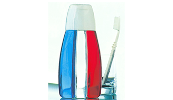
Aquafresh USA commissioned Trademark Design to develop an Aquafresh mouthwash. The toothpaste brand's unique point of difference is the claim that can be made for the ingredients of each stripe. After months of production and consumer research Trademark Design proposed the strategy of developing "a striped mouthwash". Design development began in London, Pittsburgh and Johannesburg. The design of a 3 chamber container showed the most promise after many working models were grown. Each model modification focused on the pouring of equal volumes of a specific density of liquid into the clear...
> Read more
12h00 Clinic
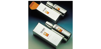
SmithKline Beecham developed an advanced day/night Cold and Flu formulation that had passed clinical trials. Trademark Design proposed a strategy of creating a brand to visually equal the advanced product. A single dose provided relief for 12 hours, this lead to an obvious choice as it included the product benefit in the brand name. To keep the design within the packaging budget, Trademark Design searched glass manufacturers' data bases for off-the-shelf containers. A near perfect container and measuring overcap was sourced. The design called for an advanced look and feel that was achieved by...
> Read more
Eno
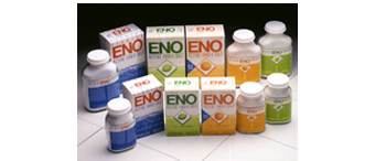
SmithKline Beecham marketed a range of six ENO SKU's which overtime had lost market share due to styling and disparate surface graphics. We were commissioned to develop a suitable solution without changing the brand too radically in fear of losing even more market share. The design solution called for a continuous band of different colour to assist the communication of the fruit flavour variants. Strong branding of the logotype made shelf identification easy as a "Gestalt" effect was achieved.
> Read more
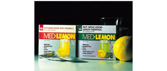
Med-Lemon
Warmth, strength and cold-busting are three words that have become synonymous with Med Lemon hot cold remedy. Past packaging for the brand was disparate and differed greatly from one variant or size to the next. Trademark Design's project was to rationalise the brand by unifying the surface graphics. The most common elements were that of the name and colours(per variant). The simple design rational was to echo the carton graphics onto the label.
> Read more
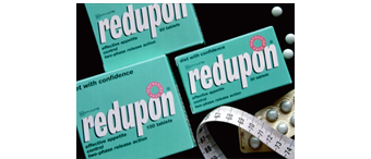
Redupon
Redupon's active ingredients provide an adjuvant treatment of obesity by means of daytime and early evening suppression of appetite. It provides a two-phase release action that lasts from noon to early evening and thereby simplifies the patient's dosage schedule. The brand commanded a significant part of the market share, however is faced by continuously having to fend off new competitors. The design strategy was to ensure that the branding on pack is clear and legible and easy to recognise on shelf.
> Read more
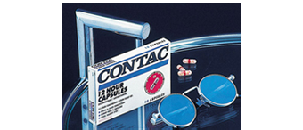
Contac
Contac offers a variety of formulas for relief of cold and flu symptoms. All are multi-symptom remedies, designed to relieve a specific group of symptoms. Because symptoms can occur alone or together, different ailments require different formulas. Trademark Design developed a simplified set of surface graphics for the brand and provided all the reworked reproduction artwork for more that 40 States across the United States and Canada. Virtually each State had different legal medical text on the range of packages.
> Read more
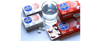
Disprin
The Disprin brand is a household name in pain relief, however had over time become diluted. The design strategy was to evaluate all of the elements on the cartons and foil sachets, refine all the key components and dispense with the obsolete additions. A new directional graphic device was added to aid the communication of fast relief. Colour differential between the regular strength and the fast relief variant is a significant improvement as both cartons are 3 colour print with the background colour simply being reversed.
> Read more
