Trademarks
Nedbank Wealth
Most major banks do not promote any significant point of difference to their customers, Nedbank Wealth sought to explore the opportunities to do just that and asked Trademark Design to "find another path". Trademark Design's strategy was to develop a visual point of difference from the parent brand, one that is "a reflection of who the target audience is."
> Read more
BankFin
In 1992, Absa acquired the entire shareholding of the Bankcorp Group which included Trust Bank, Senbank and BankFin. BankFin was created as the financing arm of the group. Trademark's solution to identify BankFin as an integral part of the group was to symbolise the balance and equality in the group. 3 squares balancing in perfect harmony illustrated this concept. The identity was rolled out across all their national branches which included signs, interiors, stationery and advertising.
> Read more
Barclays Asset Management
Barclays Asset Management sought to identify themselves as a sub-brand to the Barclays banner. The majority of clientele rarely visited their central city office, however when they did, our client wanted a distinguished look and feel. Trademark Design created a discreet trademark of a Doric column to instil confidence and solidarity. The office reception area has been decorated in a conservative style with the trademark fabricated in brass to add a golden richness to the area. Stationery and print identity rendered in simplified gold.
> Read more
Liberty
Liberty is a progressive wealth management group, which for more than fifty years has delivered long-term solutions that assist customers to achieve financial stability in their chosen lifestyles and throughout their life cycles. The origin of the torch trademark is that of New York's Liberty statue. Trademark design was commissioned to create a strategy and design a device to be more approachable and offer customers flexible choices and confidence to make the right choices no matter what their stage of life. The flame was simplified and a stylised protective shield added with multiple...
> Read more
BOB
Barclays Omni Bank (BOB) The card and Atm division of Barclays had for a long period been trading with the Barclays trademark that was left over from the Anglo American acquisition of Barclays in South Africa which was renamed First National Bank (FNB). FNB commissioned Trademark Design to submit schematic opportunities/solutions that would solve the identity issues. We proposed that the name BOB be retained in conjunction with a new identity that separates it from Barclays. The device represents an electronic pulse running through the "O" of BOB.
> Read more
BOB T
Barclays Omni Bank (BOB) briefed Trademark Design to provide strategy, design development and to assist in final production of a product aimed at the teen market. The solution that proved to be an outstanding success was the creation of a radically different card to what had been produced before. We sourced an luminous transparent yellow acrylic sheet to match the colouration of the BOB trademark that could be printed on both sides with positive and negative graphics. The graphics are dominated by a large "T" and a multicolour finger print plus lesser important technology symbols.
> Read more
Ethos
"With our unique approach to investment opportunities that were previously unavailable or not considered, Ethos brings a distinct service to private equity investment". To communicate a distinct differentiation within a competitive market Trademark Design has harnessed the visual association to the name. Ethos expresses the core characteristics of how the company approaches businesses, and the service that is provided. To convey this Ethos we have selected the purest and most precious metals, Gold and Platinum. The purity of design captures the spirit of quality. Ethos is respected and...
> Read more
Charter Life Assurance
Charter Life Assurance was a pioneer in offering alternate life assurance products, their brief was to create an identity that communicated both the sense of establishment and future thinking. The original corporation was established from the merged products of satellite companies. The trademark is symbolic of an official or legal paper seal and the white dove of peace which when, reproduced in the bottom right side of applications created the status of officialdom.
> Read more
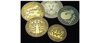
Namibia Bank Coins
During the planning phase of the introduction of a new national currency replacing the South African rand, the newly founded Bank of Namibia minted a proof series of coins denominated in dollars and cents as well as in marks, for the consideration of the Namibian Ministry of Finance. The decision then fell in favour of the name 'dollar' for the new currency. Clive Gay and Koos le Grange past members of the Blue Sky group, partnered to form the design and management team to develop the Namibian Coin designs. The range of coin designs included the following themes to echo the Bank Notes concept...
> Read more
Namibia Bank Notes
Clive Gay and Koos le Grange past members of the Blue Sky group, partnered to form the design and management team to develop the Namibian Bank note designs. Kaptein Hendrik Witbooi' (1830-1905) portrait and the parliament building in Windhoek were pre-requirements to be the prominent features on the front of the notes. The reverse sides featured: 10 Dollars - Springbok, 20 Dollars - Red Hartebeest, 50 Dollars - Kudu, 100 Dollars - Oryx, 10 Dollars - Roan Antelope. Security featues included BON see-through logo. Green-to-gold OVI diamond with latent image. A watermark of Capt. Hendrik Witbooi...
> Read more
South African Reserve Bank
Early 1988, the Governor of the SA Reserve Bank, Hendrik de Kock commissioned a group of South African designers who became known as "Blue Sky", to design new bank notes for the country. The group comprised C Gay, K le Grange, E de Jong, and C Webb. The Brief was to remove any reference to SA's colonial past. Blue Sky researched bank notes from around the world to establish superior security features and to create new security features. The initial design proposals were dismisses as being "to modern". The second designs were approved immediately and development of the final security...
> Read more
DevBank SA
The Development Bank of Southern Africa is one of several development finance institutions in South and Southern Africa. Its purpose is to accelerate sustainable socio-economic development by funding physical, social and economic infrastructure. The goal is to improve the quality of life of the people of the region. Trademark Design developed a strategy to brand the bank as the highlight of Southern Africa and the role it has to play across the whole of Africa. Symbolising Africa in green is the mechanism to show growth and prosperity.
> Read more
