Trademarks
De Beers
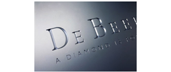
A family of companies that dominate the diamond world dates back to 1888 and is embellished with countless stories of pioneers, discovery, entrepreneurs, romance and tradition. Trademark Design created the collateral material to establish global compliance. 3D signage and digital applications, company literature and promotional collateral material employ the engraved logotype developed from the original bespoke letterforms of the company's historic signature. 2D signs and print reproduction for stationery and forms apply a line conversion of the logotype.
> Read more
De Beers Venetia Mine
Venetia is an open pit mine and South Africa's largest producer of diamonds, contributing 40% of the country's annual production. The mine is in Limpopo Province in the northeast corner of South Africa. De Beers sought to identify the mine with a contemporary representation of the Lion of Venice. Trademark's graphic interpretation is symbolic and has taken into account the need to retain recognition and detail when reproduced in small sizes and when used in the extremely dusty and industrial environments. The Venetia trademark is reproduced in black to avoid discolouration in the dark grey...
> Read more
Sishen Mine
The mine has been operating since 1947. Ore is processed from in a single pit in two beneficiating facilities, with a lump-to-fine-ore ratio of 60:40, compared with 30:70 globally. Sishen mine is Kumba's flagship operation and one of the seven largest open-pit mines in the world. It operates around the clock, twelve months a year, and in 2010 produced 41.3 million tons of iron ore. Sishen is situated in the wild bush lands of Southern Africa and nearby is inhabited by massive herds of Oryx.
> Read more
Indian Atlantic
Before the acquisition of Iscor and the eventual merger of Arcelor and Mittal Steel to form ArcelorMittal in 2006, Trademark Design was commissioned to explore the opportunities in creating a new identity inline with managements vision. As a raw material producer located between the Indian and Atlantic Oceans the name suited the brief. The application to massive and heavy duty equipment was a prime consideration. The trademark and logotype have been designed as stencils to allow large cost effective applications. When applied to print and advertising the appearance is industrial yet...
> Read more


